How we assess country risk Part 2: The search for relevant explanatory factors

Bernhard Obenhuber
Aug 26, 2024

In this blog post, we take a closer look at indicators which have relevant explanatory power in signaling elevated sovereign default risk. This builds upon the previous post (link), which covered the various data sources and caveats for historical sovereign defaults.
Distress & default
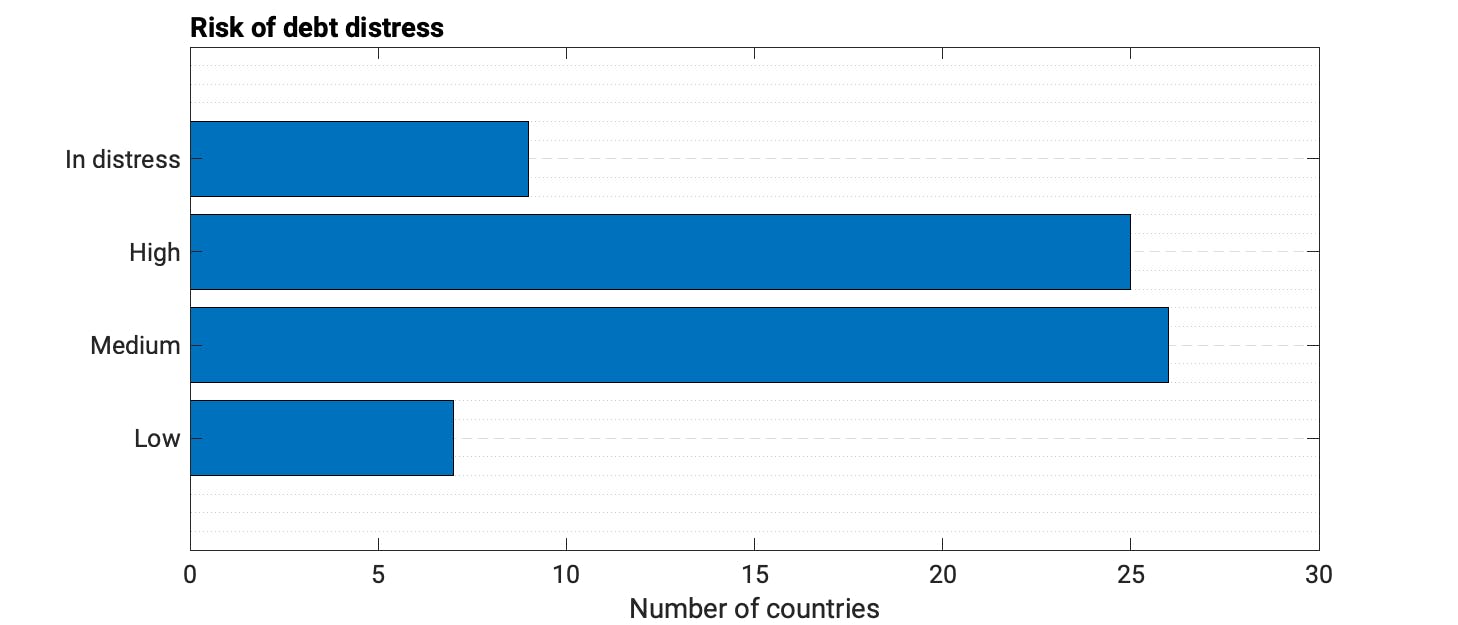
Out of 69 low-income countries, The World Bank and IMF currently classify Congo, Rep., Ghana, Grenada, Lao PDR, Malawi, Sao Tome and Principe, Sudan, Zambia and Zimbabwe as being in (debt) distress.
The list of countries expands when we consider those that are classified as being at risk of debt distress. You can find the full list and related debt sustainability reports here (link).
What follows thus explores more closely macroeconomic indicators that are material in spotting future debt distress or are candidates for sovereign default. A future post will expand the analysis by examining other relevant factors such as the global business and interest rate cycle or force majeure events like war, political coups or natural disasters.
We use information from S&P and Fitch in identifying countries in sovereign distress, and we adhere to using the lower or weaker sovereign rating if both agencies assess a country. As we are mainly dealing with annual macro data, we always use the sovereign rating applicable at the end of a calendar year to relate the rating with the economic data.
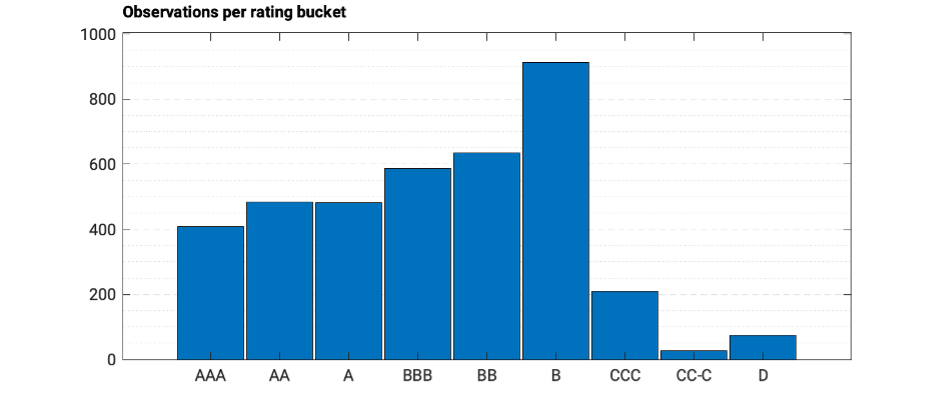
Taking information as far back as the early 1990s, we gather around 3,800 rating observations, which we then consolidate into the commonly recognised letter rating buckets. The histogram below depicts the number of observations per rating bucket and the plot instantly highlights a key challenge: the number of defaults is relatively low. It’s positive for the world but a complication for data analysis.
And out of the 74 observations, we also have various repeat “offenders” such as Argentina. Side bar: The rating segments of CCC and below also deserve a separate blog post at one point.
The proverbial search for the needle in a haystack
With historical default and rating information in hand, we went our way to look for explanatory indicators. There are thousands of potentially relevant indicators, and we do not claim to have looked at all of them. Please reach out to us and share your most relevant ones – we promise not to disclose.
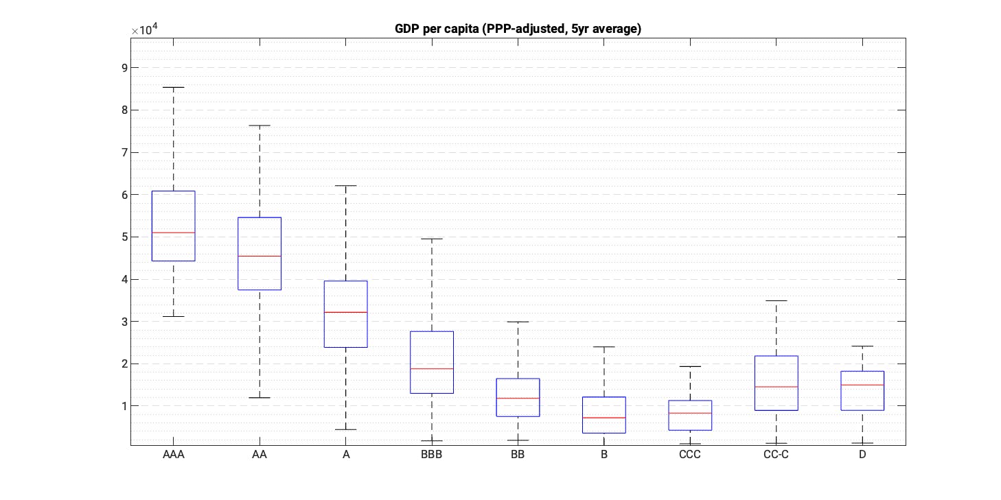
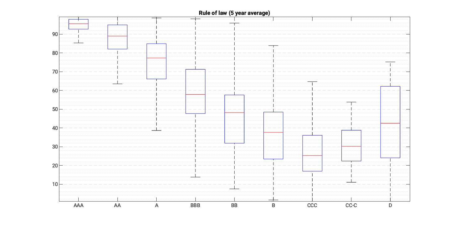
The following boxplots relate the historical values of a specific indicator to the rating of the respective country in a given year. Please reach out to us if you would like to receive all charts. In the best case, we have indicator values for all country-rating-observations. In several cases however (e.g., the IMF reserves adequacy ratio), this is not the case. The list of short-listed indicators is given thus:
Real economy & inflation
- GDP per capita
- Real GDP growth rate (relative to world)
- Change of domestic credit to GDP
- Savings to GDP
- Investment to GDP ratio
- Inflation rate (relative to world)
Trade & external balance
- Export growth (5yr average)
- Current account balance to GDP (5yr average)
Public finance & external debt
- Government debt to GDP
- Fiscal balance to GDP
- Interest payments to exports
- Interest payments to government revenues
- Import coverage ratio
- FX reserves growth
- Short-term debt to FX reserves
- Net external debt to exports
- Net external debt to GDP
Governance
- Regulatory quality
- Government effectiveness
- Corruption
- Rule of law
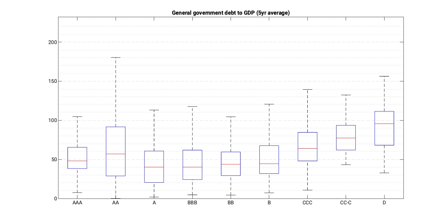
All indicators provide a good differentiation of sovereign risk and exhibit an instructive correlation. Nevertheless, for various indicators the strength of differentiation weakens for the lower or higher rating segments.
One case in point is GDP per capita and sovereign ratings show a strong correlation for the rating buckets of AAA and B. But below this level, the relationship weakens and even flips around (i.e., sovereigns in default have higher income levels than countries with a CCC rating). This arises when the credit rating of a sovereign deteriorates quickly from a relatively solid level as in the case of Greece, and the rather structural and slowly moving indicators like GDP per capita do not move rapidly enough or in tandem. The same pattern occurs with other indicators ,like the World Bank governance indicators, such as the rule of law.
Conversely, the debt to GDP indicator doesn’t seem to be very useful in differentiating between higher- and lower-rated sovereigns. A prime example is the US that has a (very) high government debt ratio, but nonetheless enjoys a favourable rating assessment by the agencies – which, to a large extent, is due to the USD’s reserve currency status.
Tipping points
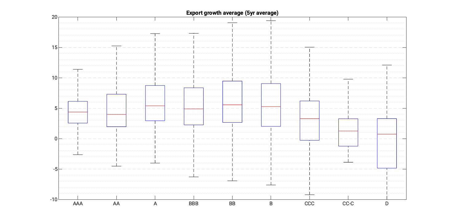
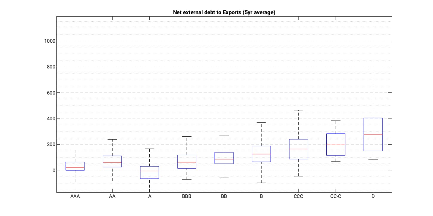
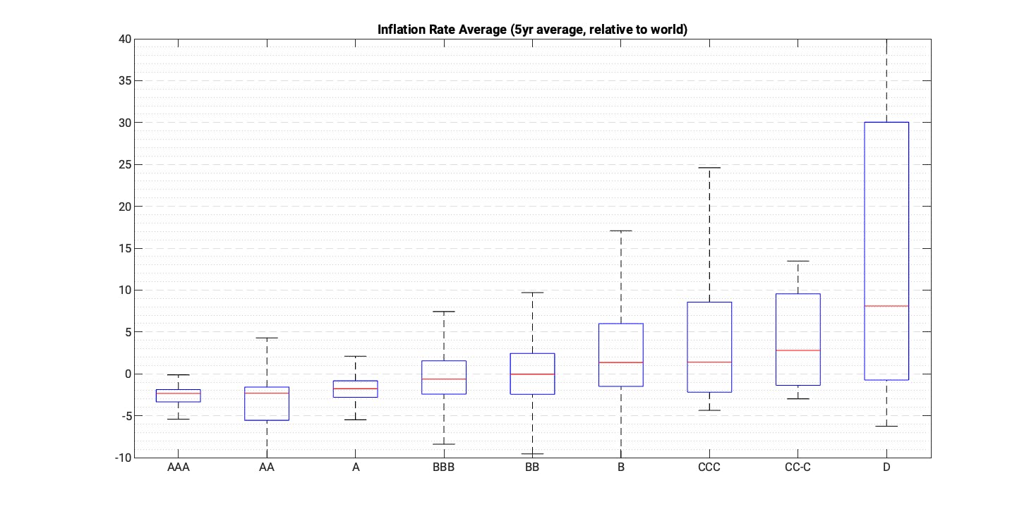
While the afore-mentioned indicators are clearly useful in identifying countries with higher sovereign credit risk, it is equally instructive to look at other candidates to help in spotting countries that are in the brink of default or are in debt distress. And for this, we need metrics that fluctuate more with the business cycle and credit risk changes. For example, it appears that countries very close or in default exhibit lower export growth, high debt servicing costs, large fiscal deficit and high inflation rates.
Solvency & liquidity risk = distress
To identify countries at risk of debt distress and default, we first group the indicators mentioned earlier into two groups based on their characteristics: solvency and liquidity. We don’t claim that the grouping and naming is perfect, solvency could also be called structural risk, and liquidity could be called cyclical risk. The two dimensions are useful to group countries into four buckets:
- Low solvency risk and low liquidity risk: Strong ones
- Elevated solvency but limited liquidity risk: Muddling through
- Low solvency risk but high liquidity risk: Needs close monitoring as such countries are likely to move into the next and highest risk category
- High solvency risk and high liquidity risk: Countries close or already in distress

We’ve highlighted the countries from the highest risk bucket and not surprisingly, many of the countries mentioned at the beginning of the post feature prominently in the chart. Overall therefore, the selected indicators allow a good assessment of sovereign risk. The differentiation between the two dimensions is also helpful as it provides guidance in how to read and classify certain indicators as well as their critical threshold values.
Tracking the momentum
The boxplots shown earlier show that the selected indicators help us to assess sovereign credit risk – or at least sovereign ratings. It is equally – or perhaps even more – important to have a good understanding of the momentum of macro-fundamentals. This is even more important for countries with weaker fundamentals, for which we would want to know if the direction of change points towards sovereign distress and ultimately, a default. We can do this by looking at the indicators around past default episodes for the selected indicators.
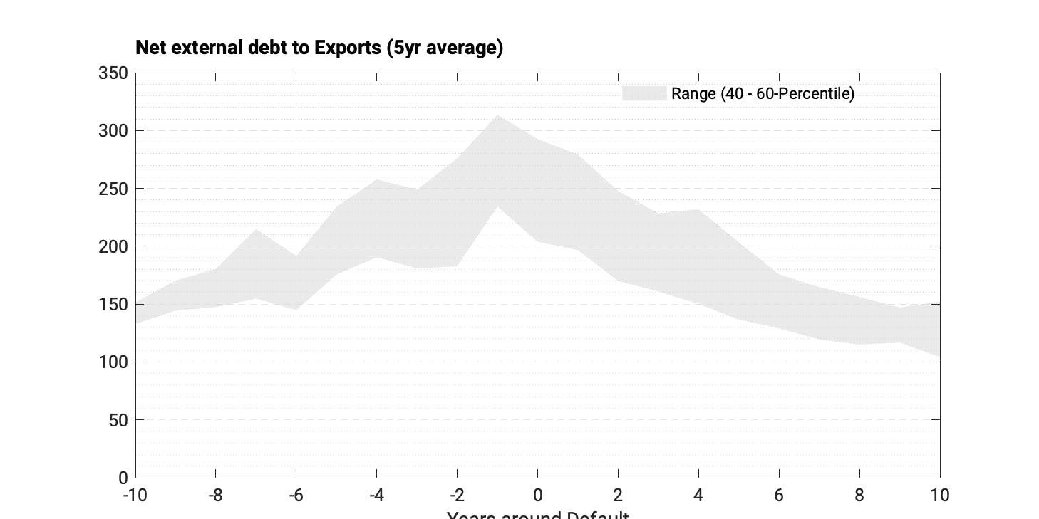
The chart below shows the net external debt to exports ratio 10 years before and after a sovereign default. The ratio increases significantly in the run up to default, attributable to both higher nominal debt levels and often weaker exports.
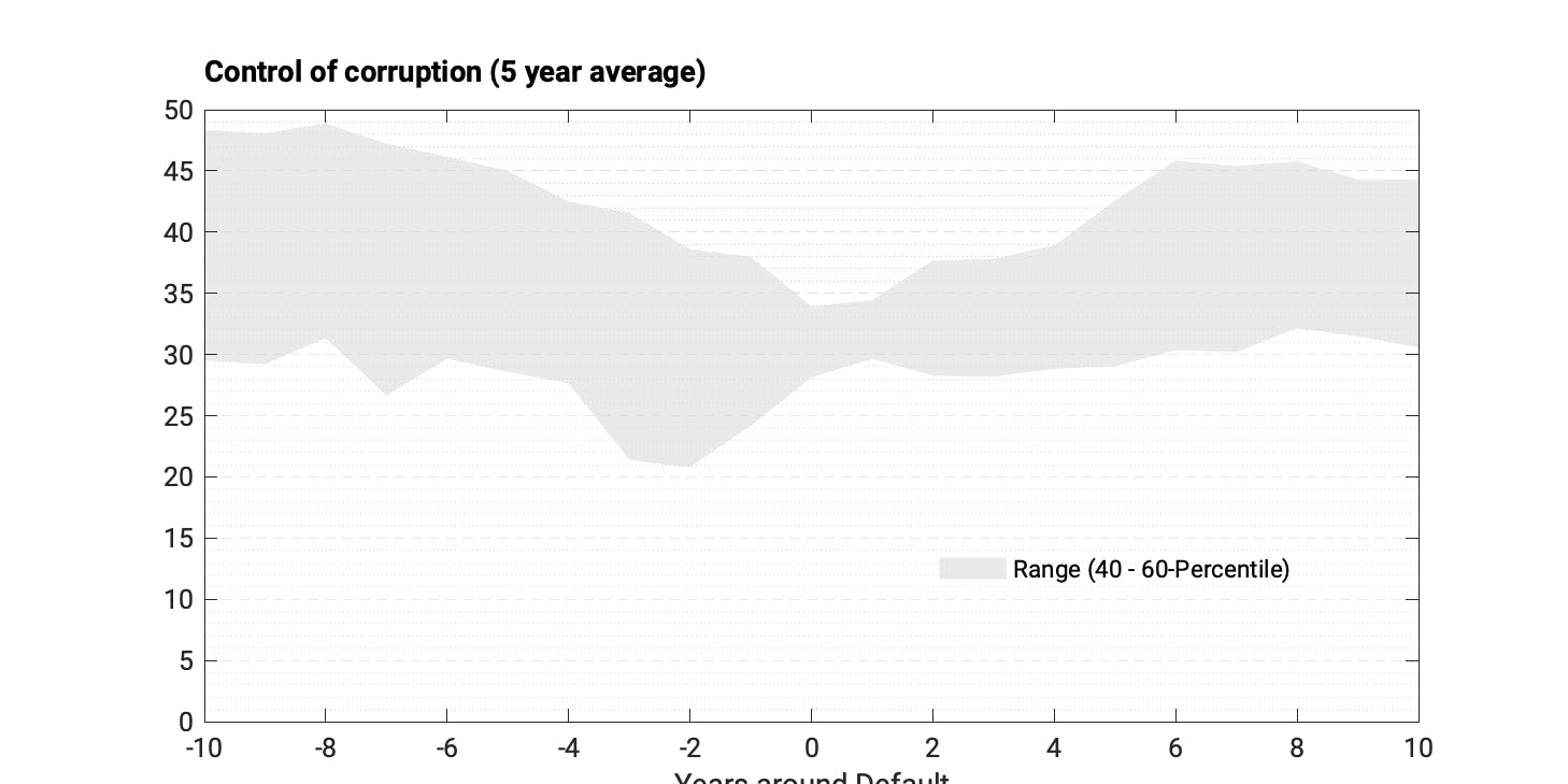
Similarly, the development of the World Bank corruption indicator suggests that there is a deterioration of the institutional quality over many years before the default.
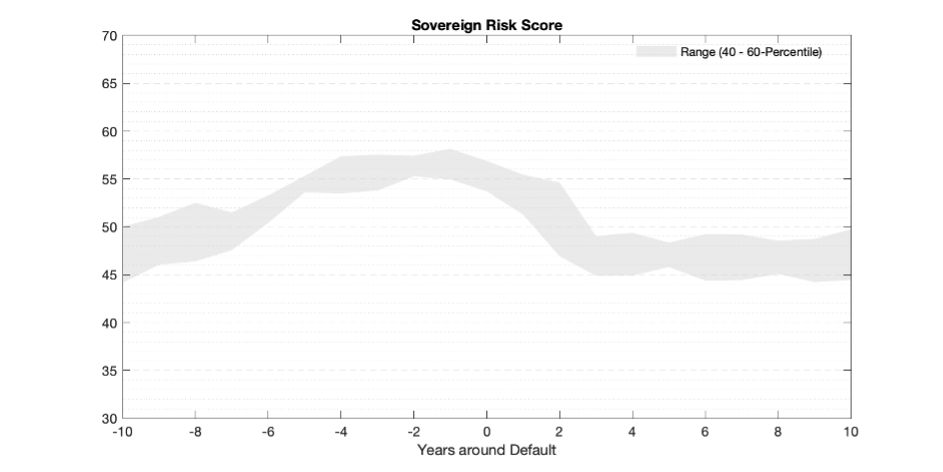
As we aggregate all the mentioned indicators into the CountryRisk.io Sovereign Risk Score, we can also check how this score develops around defaults. The chart below shows that the score weakens from around 47 to close to 60. But it also shows that a country can muddle through with weak fundamentals for several years before it collapses.
As the Sovereign Risk Score deteriorates to elevated levels, the presented analysis suggests that specific indicators become more important (e.g., liquidity indicators), and it is important to augment the analysis with higher frequency indicators. This shall be a topic of a future blog post.
